
L’azienda croata Naturalis mirava a rafforzare la reputazione del suo marchio, Cetina, puntando non solo sul forte legame con il luogo da cui sgorga la sua acqua ma anche sulla sua purezza e sulla sua perfetta composizione. PET Engineering è stata incaricata di creare una nuova brand identity e un nuovo packaging design in grado di differenziare Cetina dai marchi concorrenti attraverso la valorizzazione delle proprietà fondamentali del prodotto e la chiara definizione dell’aspetto visivo del marchio per una coerente comunicazione online e offline.
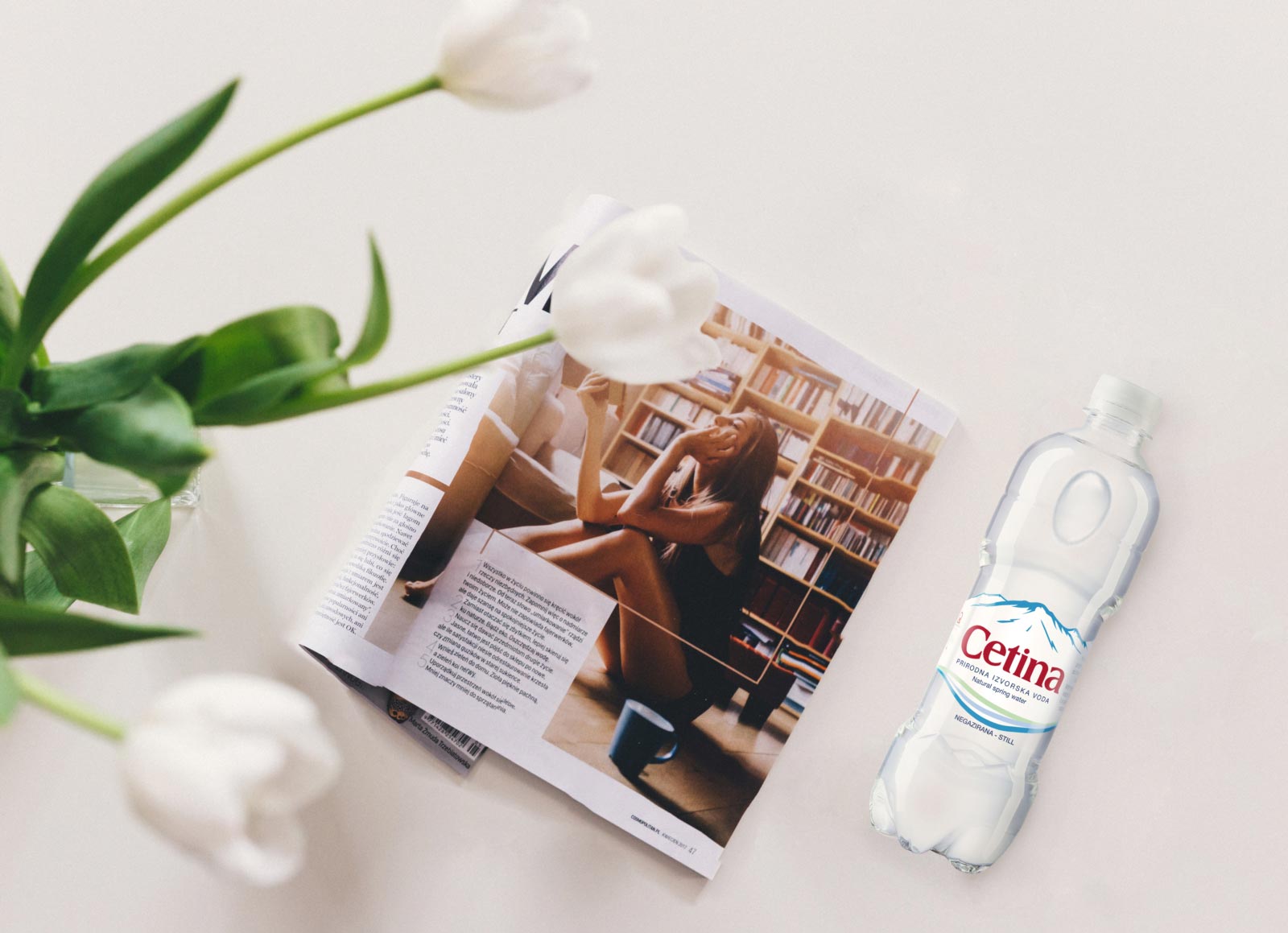
La nuova identità visiva conferisce un aspetto contemporaneo agli elementi del marchio grazie a un font più moderno e sottile e alla semplificazione degli elementi che in precedenza rappresentavano i campi verdi, il lago e la sorgente, parte dell’immaginario di Cetina, ora simboleggiati da linee semplici e stilizzate.
L’importanza della montagna Dinara, dove inizia il viaggio di quest’acqua, è chiaramente comunicata attraverso le montagne stilizzate sull’etichetta e i due elementi in embossment sulla bottiglia; la purezza dell’acqua, risultato di una corsa secolare nell’oscurità tra rocce calcaree, è veicolata dallo sfondo pure white. Il nuovo packaging, disponibile nei formati 0.5l, 1.0l e 1.5l per acqua naturale e gassata, è elegante e minimale perché Cetina non ha bisogno di alcuna sovrastruttura per comunicare se stessa, in quanto ha già ricevuto il meglio dalla natura.
+INFO: www.petengineering.com

Cetina: a gift from Nature, simply bottled
The Croatian company Naturalis aimed to strengthen the reputation of its brand, Cetina, by focusing not just on the strong connection with the place where its water flows but also on its purity and its perfect composition. PET Engineering was asked to create a new brand identity and a packaging design able to differentiate Cetina from the existing water brands highlighting the core authentic properties of the product and defining the visual aspect for a coherent online & offline brand communication.
The new visual identity gives a contemporary twist to Cetina’s brand equity elements thanks to a more modern and thinner font and to the simplification of the symbols that previously stood for the green fields, the lake and the water source, now symbolized by simple and smooth lines.
The importance of the mountain Dinara, where the journey of Cetina water begins, is clearly communicated through the stylized mountains on the label and the two embossments on the bottle; the purity, achieved thanks to a century running in the dark among limestone rocks, is conveyed by the pure white background. The packaging, available in 0.5l, 1.0l and 1.5l formats for still and sparkling water, is sleek and minimal, because Cetina doesn’t need any superstructure to communicate itself, as it has already received the best from Nature.
+INFO: www.petengineering.com