

Prigat è il brand leader in Israele nella categoria dei succhi di frutta, con il 30% del market share, ed è apprezzato e amato dai consumatori di ogni età da più 70 anni.
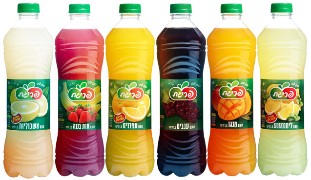
L’azienda utilizza solo frutta di qualità e, dopo essere stata la prima a proporre al mercato locale prodotti senza additivi e conservanti, ha deciso di rafforzare, nel 2014, il proprio posizionamento attraverso una attività di rebranding che esplicitasse il forte legame che unisce i suoi prodotti ai polposi e colorati frutti generosamente offerti dalla natura.
P.E.T. Engineering è stata chiamata ad allineare l’immagine rinnovata ed il packaging che, con la sua sezione quadrata e la mancanza di elementi visuali distintivi, risultava old fashioned, visivamente appesantito e poco maneggevole durante la fase di versamento.
Ridisegnando la shape i designer di P.E.T. Engineering hanno voluto porre l’accento sulla dimensione della naturalità prendendo spunto dalle linee morbide e dalla rotondità della frutta con cui i succhi vengono realizzati. La bottiglia, alta e slanciata, risulta polposa e ricca al tatto grazie alle decorazioni dal profilo arrotondato che corrono lungo il corpo e che lasciano, al centro, una superficie diritta che favorisce l’ impugnabilità della bottiglia e offre un ampio spazio etichetta per la comunicazione del brand.
La bottiglia, sviluppata nei formati 0.5 e 1.5l e riempita in asettico, presenta la soluzione brevettata Sunbase che evita l’estroflessione del fondo dovuta all’utilizzo di azoto in fase di riempimento e assicura stabilità in linea e sulla tavola del consumatore. Il nuovo design ha inoltre permesso la riduzione del carbon footprint di ogni bottiglia prodotta grazie al 20% di risparmio di materiale plastico rispetto alla precedente bottiglia a sezione quadra.
+ Info: www.petengineering.com
SCHEDA PERSONALIZZATA E ALTRE NEWS P.E.T. ENGINEERING
Succulent and natural products for P.E.T. Engineering’s first project in Israel
Prigat is the leading brand in Israel in the category of fruit juice, with 30% of market share, appreciated and loved by consumers of all ages for over 70 years.
The company uses only quality fruit and, after being the first to bring to the market local products without additives and preservatives, decided to strengthen, in 2014, its position through a rebranding that could emphasize the strong bond that unifies its products and colored fruits generously offered by nature.
P.E.T. Engineering was asked to align the renewed image and packaging that, with its square and lack of distinctive visual elements, appeared old fashioned, unattractive to the eye and not very easy to handle when pouring.
By redesigning the shape, the designers of P.E.T. Engineering wanted to emphasize the size of the naturalness inspired by the soft lines and the roundness of the fruit with which the juices are made.
The bottle, tall and slender, is pulpy and rich to the touch thanks to the decorations with rounded edges that run along the body and leaving in the middle a straight surface that makes the bottle easy to grip and allowing plenty of room for the brand label.
The bottle, developed in sizes 0.5 and 1.5l filled aseptically, presents the patented solution Sunbase which avoids any extroversion of the base caused by the use of nitrogen in the filling stage, and ensures stability both on the production line and on the consumer’s table. Moreover, the new design allows to reduce the carbon footprint of each bottle thanks to the 20% plastic saving if compared to the previous square bottle.
More infos: www.petengineering.com
CUSTOM SHEET P.E.T. ENGINEERING